
Simply Voting has launched a Redesigned Election Manager for the Voting System. From the start, we set out to craft a modern and intuitive customer experience, without sacrificing the core principle that drives us as a company -- simplicity. It was clear our Voting System’s design, while lovingly crafted many years ago, needed an overhaul to match the diverse needs of our customers and to bring it up-to-date with a contemporary approach to end user experience.
With the redesign, users will find the Election Manager more visually informing, as well as more responsive on mobile devices so they can manage their election on the go. While the redesign’s refined aesthetic enhancements are important, the functionality of the user interface remains unchanged – there is no feature loss.
So what does the Election Manager look like now? Lets take a brief tour!
Account Navigation and Settings
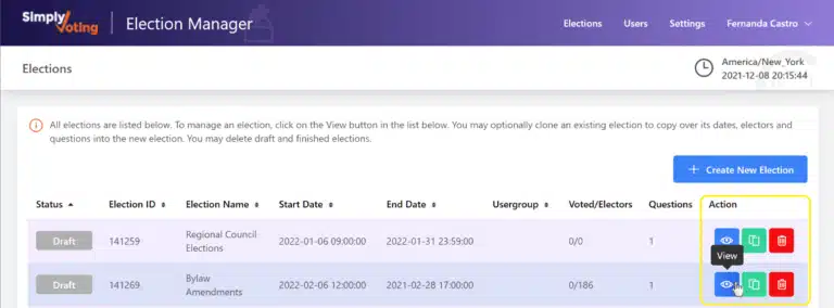
Upon logging in, as before you begin on the Elections page, with a listing of all your elections. In the screenshot below, highlighted in yellow, is your main navigation menu within your account -- analogous to the same navigation menu that was previously across the top of the Elections page. From this menu, you will find additional pages for managing account Users, account Settings, as well as your own User Profile and Security, and a way to return to the main Elections page.

With a deeper look into the Settings page, again highlighted in yellow, you'll find familiar pages that cover your Organizational Details, Billing history, Voting Website design, and the overall Account Log. Other sections from the "old" Settings page exist here too.
Election Management
While managing your elections might look a bit different, again the underlying structure and wording remains unchanged to help ensure users won't find themselves lost. Throughout the Election Manager, now users will find tool-tipped buttons to help guide them along the way in various Action columns, mimicking the "old" action links. In the screenshot below, we're heading into an election to further manage it.

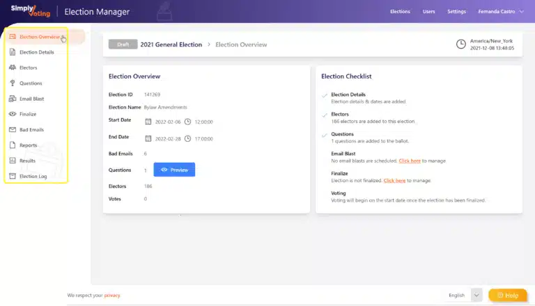
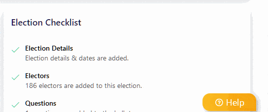
Once inside an election users will find a navigation menu, as shown in the screenshot below and highlighted in yellow, that mimics the "old" dropdown navigation menu. Again the order and wording remains unchanged to help ensure users can navigate with ease. Plus, within any draft election you'll find the handy Election Checklist to help keep you on task.
Help!
If you are feeling a little overwhelmed, don't worry! As you may have noticed, in the right corner of screen you'll always find a little Help button following you around, on any page within the Election Manager. Clicking Help will bring you to our expansive suite of Guides that can walk you through anything step-by-step. Our Help documentation has been updated to match the user interface experience, so keep it handy as a resource.
And if you need more support or have additional questions, our Support Team is always standing by!
Final Thoughts
We hope our redesign meets your expectations and approval. We've listened to our customers and outside experts to deliver a more intuitive experience. However at Simply Voting, development never stops -- and we can look forward to continued improvements to the new interface over time.